2 tricks to test responsive webdesign in Chrome without a plugin
A lot of people know about the CTRL + SHIFT + M trick in Firefox to test responsive website, but did you know that Chrome Dev Tool offers some similar options ? This was tested in Chrome 28+.
Trick 1 : Chrome Dev Tool and the ruler
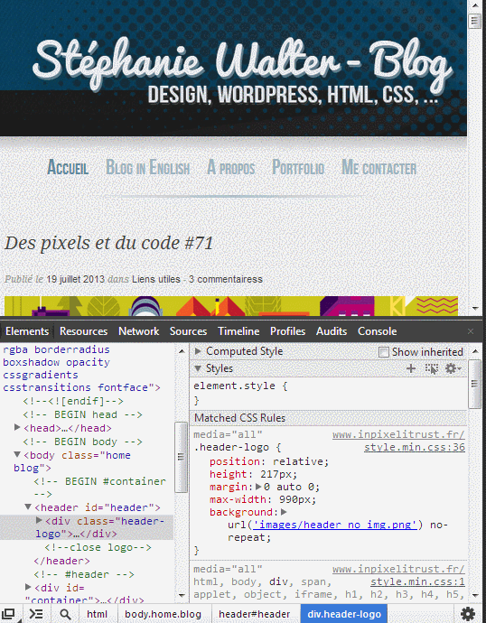
When you open Chrome inspector and then you resize your browser window, you know get a little horizontal and vertical ruler on the top and left side of the browser. With this ruler, you can pixel perfect resize the browser window.

The problem is that when you resize, you lose a big part of the URL bar and access to your plug-ins. This is when you will like the second tip.
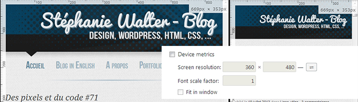
Trick 2 : the “Device metrics” option in Overrides.
If you are still in the inspector, you can click on the little gear on the bottom right to open the settings. Into those settings, you will find a tab called “Overrides”. The first checkbox enables you to change the UserAgent of the browser and trick the site into thinking you are an iPhone for example.
It’s the second option that will be interesting here: Device metrics. When you check this one, you enter a sort of “responsive mode” that will enable you to change the height and the size of a fake second window (like an iframe) that will contain your website, without the need to change the size of the whole browser. The button on the right enables you to switch between portrait and landscape mode.
Conclusion
Those two little ricks are pretty helpful but IMHO they are still far from what Firefox offers. When using the “Device metrics” option you have to manually enter the values and can’t change the size “on the fly” like you can do in Firefox. The Chrome option is also kind of “hidden” and less intuitive than the simple CTRL+SHIFT+M (maybe there’s a keyboard shortcut in Chrome, I admit I did not look for it), but it’s still a great start to make you webkit responsive tests (blink in some days) easier.
